
Simulating a University
The Artificial University (TAU) is an epidemiological model with a special feature: it takes seriously human factors in the spread of the SARS CoV-2 virus, including compliance (or non-compliance with public health recommendations and the effects of social networks. Under the hood, TAU is agent-based simulation equipped with a contact network describing university classes, dorms, and activities both on and off campus. It also includes pretty much every kind of intervention you can imagine, from social distancing to hybrid classes and from quarantining infected students to over a dozen testing regimens. Users of TAU can select a combination of interventions, expressing politically acceptable possibilities in a given university context, and TAU calculates the the degree of infection spread after a semester.
The infection spread model takes into account varying levels of illness duration, asymptomatic cases, and variable likelihood of death based on age. Since we were only modeling one semester (120 days) and likelihood of reinfection is unknown, we conservatively inputted a “worst case” that agents could be susceptible 90-120 days after recovering. Agents each behave in unique ways, having their own likelihoods for behaviors such as reporting that they have symptoms, choosing to isolate when contact traced, and their dedication to isolating.
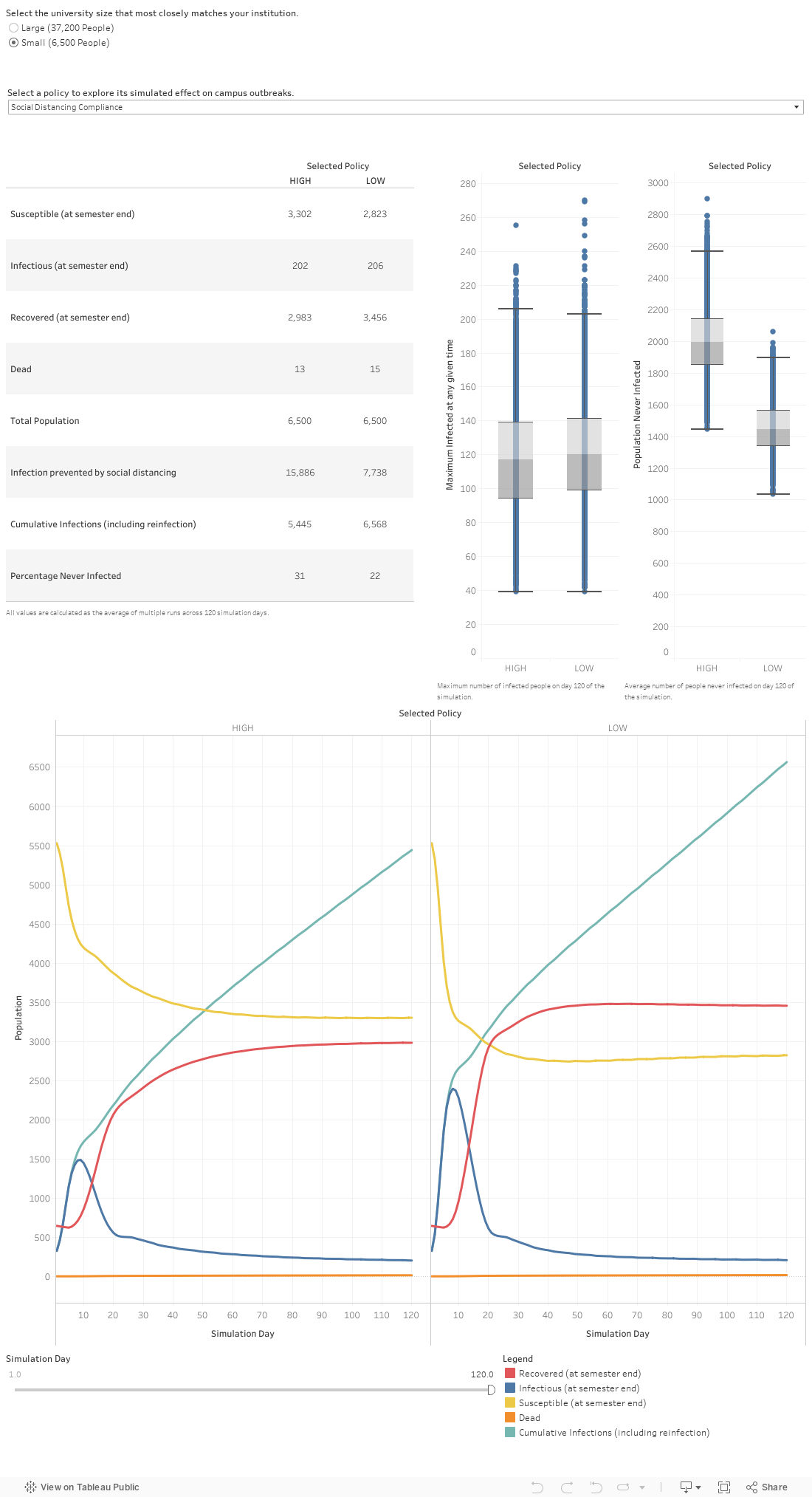
TAU uses two university profiles: a large research university of 37,200 people, and a small liberal arts college of 6,500. For these two universities, we uniformly sampled the parameter space, varying which measures were used or not used, in order to estimate the spread of infections.
In the mini-playground below, you can explore the effects of interventions individually. First choose which university to examine. Then select one of the following options:
- Cancel Events: Cancel campus events
- Cancel Sports: Cancel sports events
- Location tracking: Have centralized location tracking, allowing for near-perfect contact tracing and isolation compliance
- Likelihood to report symptoms: the likelihood that a symptomatic person will report that they have symptoms to a central tracking body
- Open Fitness centers: whether or not to keep fitness centers open
- Hybrid classes: whether or not to split classes into platoons of rotating virtual/in-person groups
- Social distancing compliance: whether the population has a high or low social distancing compliance overall
- Open student groups: whether or not student groups are allowed to meet in-person
The graphs will immediately change to show you the overall effect of that policy. The range of results is due to the fact that all the other policies are being implemented and not implemented in various parts of the underlying dataset. However, because the parameters where chosen in a uniformly random manner, the aggregate trends are a meaningful indicator of the individual effect of each policy.
The two graphs on the right show you the mean and variance of results with the selected policy on according to two metrics (it’s a box and whisker plot, in case you want all the details). The metric used in the left graph is the maximum number infected at any given time – universities want to keep that low, especially when they have a limited supply of quarantine rooms for infected students. The metric used in the right graph is the number of people never infected – universities would like to keep that low, too.
Below that you’ll see two line graphs. These display the key epidemiological numbers as the simulation unfolds over the course of a semester. The left graph shows what happens when the policy is not implemented; the right graph shows what happens when the policy is implemented.
This tool doesn’t show the effects of combining selected policies. For that, look further down the page.
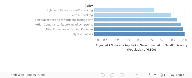
Combinations of Interventions
From our parameter sweep, we can train regression models on the data and outcomes. Adjusted R^2 is a measure of the variance in an outcome variable that can be accounted for by such models. By increasing the number of parameters we allow a regression model to use, we can see how the parameters work (or don’t work) together to account for variance. High compliance with social distancing and masking rules is the most significant factor, and that’s represented in the top bar. The next bar shows how much variance in health outcomes TAU can explain when you combine high compliance and central tracking. The third bar shows the top three factors, and so on.
Other Resources
Most epidemiological models don’t take account of human factors such as compliance and social networks. TAU does. TAU is an open-source product developed using AnyLogic simulation software. You can explore it yourself if you are technically inclined. The GitHub repository containing TAU code and documentation is https://github.com/centerformindandculture/TheArtificialUniversity/tree/V1_1. You can also find out more about TAU at https://mindandculture.org/projects/modeling-social-systems/vivid/.
TAU was developed under the the auspices of the COVID-19 Health Care Coalition (c19hcc.org) with the Center for Mind and Culture leading a coalition including representatives from The MITRE Corporation, the University of Western Sydney, Boston University, and the Virginia Modeling, Analysis & Simulation Center. The tableaus above were created by our partners at the Virginia Modeling, Analysis & Simulation Center.
TAU is still under development, including new partners, so stay tuned for further updates.
An academic publication presenting TAU has been published in Complexity. Read the article here.