This is an article in our new series exploring and explaining the concepts that underlie our research. Many of our projects integrate highly involved, deeply technical theories and methods, which can be hard to understand without proper training. These posts are intended to break down those abstractions and put them in context.
How should we study human societies?
The social and behavioral sciences utilize a number of qualitative and quantitative methods, from deep-dive ethnographies written while living amongst a group of people to rigorously designed psychological experiments. Social Network Analysis is another method, one that’s been increasingly popular among sociologists, economists and a host of other experts and one that CMAC has found valuable in several different projects (such as our Extremist Violence Project or Field Mapping).
Despite the contemporary association of “Social Networks” with social media platforms such as Facebook or Twitter, Social Network Analysis refers more broadly to the study of culture and society through the lens of relationships. In this article, we’ll walk you through exactly what a social network analysis might look like, and provide a real-world example to show you why it’s useful to answer certain types of questions.
Social Network Analysis Demystified
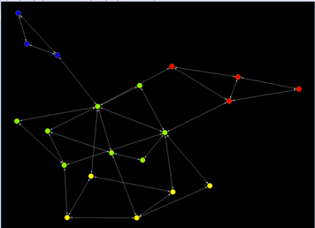
Let’s say we have a group of 20 people. We ask each of these people to say which two people in the group they consider to be their two closest friends. We can then draw lines between individuals if they have a relationship (either being named as a closest friend, or having named that person as a closest friend).
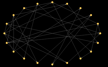 The circles represent the “individuals,” called the nodes of a network, and the lines represent friendships, called arcs since they are directed from one individual to another (undirected links are called edges). Now, drawing the nodes and their arcs here begins to illustrate the connections between members of this group, but it doesn’t really help us understand the overall structure of the group. To figure out the overall architecture of the group’s interaction, we run an algorithm that graphs the individuals based on the closeness of their relationships.
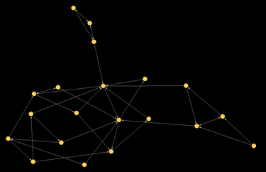 This is a much more interesting picture, showing us who is more peripheral and who is more popular in the network, as well as if there are any distinct cliques or subgroups. Note that no one is fully isolated in this group (as measured by an absence of connections to others), but that we could create two separate friend groups by deleting just one relationship (seen in the upper center, also known as a bridging relation) and leaving that trio on their own.
Now that we have a picture of our network, what kinds of questions can we ask? Often network analysis focuses on structural questions such as centrality and clustering. Intuitively, centrality refers to the most “central” individual within a network. This can help us determine leadership or influence patterns. One way of calculating centrality is assigning scores to each individual based on how many connections they have, which is called their degree. 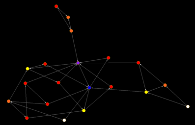 Running this for our friendship network above, we calculate their incoming or indegree based on how many other nodes nominated them as a closest friend, and recolor them accordingly (White=0, Red=1, Orange=2, Yellow=3, Green=4, Blue=5, Purple=6)
This shows us that the individuals placed at the center of the graph are more central than the others – i.e. they have been chosen as friends more than others. In the real world, social network centrality often tends to be self-reinforcing, as individuals who are more popular are viewed by others as better potential partners. In other words, popularity begets popularity, and real social groups have strong central “stars” in the middle.
There is also a value in the individual that bridges the gaps between different groups, known in social network analysis as the idea of betweenness centrality. Think of all the advantages of being an intermediary: you can effectively work as a middleman, gaining access to all different kinds of information with people reliant on you to pass things along. Sociologist Ronald Burt famously developed this concept based on his theory that organizations have structural holes, which enables individuals who act as brokers to reap a number of social and economic advantages over those whose relations are interconnected.
Looking above, who would you guess has the highest betweenness centrality? That’s right, the most central (purple) node also has the highest betweenness, serving as an access point that unites the entire network. But what would a network look like if the highest betweenness centrality was not also the most central in terms of degree or number of connections?
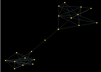 In this figure on the right, we can see that although the node in the middle doesn’t have very many friends, it is the sole means through which information can be communicated between the two different subgroups. So, it ends up with a fairly central position in the overall network even without popularity.
So far, it all might seem fairly straightforward. But we also have to ask if there are any meaningful subgroups that are not obvious to the naked eye? There are several ways that network analyses search for an answer to that question. We’ll use the Louvain Method, which runs repeated tests of different organizations of the network until it finds their optimal grouping. Returning to our original friendship network we get the following clusters.
 This is a pretty small network, so the grouping of the communities feels pretty intuitive. But this same process works equally well in massive networks of thousands or even millions of nodes, and it helps researchers determine the best way to break their big datasets down into smaller worlds and clusters.
The investigation of network structure is very useful to address topics as diverse as culture, meaning, identity, politics, social movements, and many others. Social network analysts employ an array of descriptive, statistical, and ethnographic techniques to investigate such issues.
Real-World Example: Partisan Voting Patterns
Okay, so let’s talk about why we might want to model group dynamics with a real world example. Let’s say we’re interested in partisanship in Congress – a popular topic in today’s news. We want to know if parties operate in the way they are perceived to operate – that is, functioning as blocs. To do this, we decide to look at how voting in the United States Senate breaks down across party lines.
In this example, we took data from the last 10 votes in the US Senate (freely available from the Library of Congress), and created a data set that scored the relationships between every different pair of senators based on the similarity of their voting patterns. Since some votes are essentially unanimous (generally on closures and other noncontroversial, procedural matter), this creates an extremely dense network, as 99 out of a 100 senators have at least a weak link to the other 99. Mapping the network looks like this:
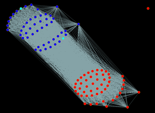 This shows up pretty much what we’d expect ahead of time, with the different clusters dividing along party lines. Note that the lone red dot in the top-right corner is Sen. John McCain, who has no links to anyone due to his recent absence from the Senate. The network also reveals that the majority of Senators vote in perfect lockstep with their party, with a few exceptions. The two big groups in the Democratic side are divided over just a single vote: Vote 158 to confirm Randal Quarles to the Board of the Federal Reserve. Mapping these relationships reveals the significance of that vote, and might pinpoint the directions of further investigation to really untangle the differences within parties.
Due to the high level of interconnection in this network, most of the network has a very high level of degree centrality, especially those within the largest Democratic and Republican blocks. In this case then, it might be more interesting to look at who has the lowest level of centrality, which tells us who the outliers are:
| 1 | Paul (R-KY) |
| 2 | Lee (R-UT) |
| 3 | Booker (D-NJ) |
| 3 | Feinstein (D-CA) |
| 3 | Gillibrand (D-NY) |
| 3 | Harris (D-CA) |
| 3 | Markey (D-MA) |
| 3 | Merkley (D-OR) |
| 3 | Sanders (I-VT) |
| 3 | Warren (D-MA) |
| 3 | Wyden (D-OR) |
| 12 | Hassan (D-NH) |
| 13 | Blunt (R-MO) |
The equally-ranked Democratic Senators on this table have identical voting patterns and can be seen in the upper left part of the diagram, while Paul, Lee, Hassan, and Blunt are the little nodes on the outside of either Republican or Democratic blocks due to having more idiosyncratic voting patterns. Just like every kind of data tool, the results gained by network analysis are only valuable when interpreted against a broader range of theories and hypotheses. Nevertheless, mapping these relationships enables us to easily visualize the people who set themselves apart and the instances in which they did it.
This is just one, relatively basic example of how we can use data to understand how people interact, how those interactions inform each other, and how information travels. The implications of this potential can be used to understand more complex systems and give order and then meaning to the dynamics that define cultures.
For any inquiries or comments, please email admin@mindandculture.org.